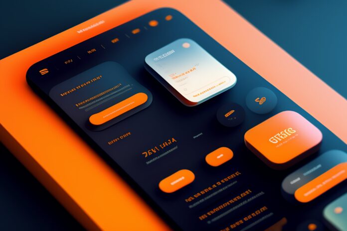
The world is becoming increasingly mobile-focused with each year that passes. Smartphones are already the most important hub for our digital lives, and this will continue in the coming years as well. This is why a good user interface is vital for apps and mobile websites.
With the number of smartphone users constantly growing, here’s what the best mobile user interface should look like in 2024.
Simple and intuitive
It’s important for any app or mobile website for its interface to be simple and clutter-free. It should have all the essential elements at hand, but little more than that. Unnecessary complexity will only confuse users. Instead of overcomplicating things, you should focus on providing your users with a clear path from their landing page to the place they want to be.
This can be achieved through clean and intuitive navigation that is consistent across the entire app or website. After all, what good is a casino app that doesn’t take players from the login page to their favourite game in as few steps as possible?
Responsive
Until recently, smartphone screens had a pretty similar aspect ratio. But things are changing: foldable phones are gaining momentum. Samsung is leading the pack, but other manufacturers are not far behind – even Apple is rumoured to venture into this direction pretty soon. This means new screen resolutions and new aspect ratios.
The Galaxy Fold’s screen has an aspect ratio of 21.6:18, different from anything before it. This means one more aspect ratio to prepare for with your app’s user interface. And who knows what other resolutions will be introduced in the near future?
Performance
The best user interface responds smoothly and instantly to user input. If an app doesn’t respond as expected, its users will likely complain about it, and maybe even abandon it in the long run in favour of one that’s more responsive to their touch.
Buttons, links, forms, and other interactive elements should be clearly distinguishable and respond instantly to touch. Plus, visual elements must load very quickly – even though the internet today is vastly faster than it was a decade ago, the patience of users is also thinner, and they expect everything to load instantly from the start.
Accessibility and feedback
Make sure your user interface is accessible to everyone – including those with disabilities. We live in the age of language models and voice interfaces, and integrating these into your user interface can make it more inclusive overall.
Giving users feedback and validation when they perform an action is also vital. Leaving them wondering if they did what they intended to or if their actions were successful will not be an option: you need to let them know.
Personalization
Finally, make sure your user interface adapts to the habits and preferences of your individual users. Quick access to their favourite functions or even games, a customizable home screen and recommendations based on their activity will make all the difference. It enhances user engagement and makes their experience much better.
As we enter 2024, the landscape of mobile user interface design continues to evolve. The best mobile UI in this era must prioritize simplicity and responsiveness, impeccable performance, accessibility, and personalized experiences. By embracing these principles, you can create interfaces that not only meet user expectations but also enhance the mobile experience in an increasingly mobile-centric world.


![SIMS 4 Download Free For PC Full Version 2019 [UPDATED] SIMS 4 Download](https://www.geniustechie.com/wp-content/uploads/2019/03/SIMS-4-Download-100x70.jpg)

